
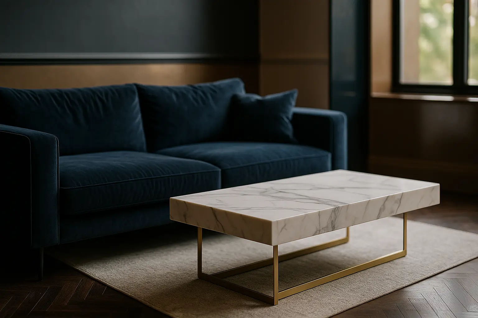
There is a particular kind of room that photographs beautifully and is exhausting to sit in. Black joinery, a marble slab, a velvet sofa, a brass pendant, a textured rug, all of it competing at the same volume. Nothing in it is wrong. The problem is that everything is shouting, and contrast only works when something else agrees to stay quiet.
The short version
- Decide which single contrast leads the room before choosing anything else.
- Contrast runs on four axes: light against dark, warm against cool, rough against smooth, large against small.
- Proportion carries the idea. A dominant field, a secondary tone and a small accent is still the most reliable split.
- Contrast that is evenly distributed stops being contrast and becomes pattern.
One contrast leads, the rest follow
Before any purchase, name the opposition the room is built on. A kitchen might be built on light against dark, with everything else held close in tone. A living room might be built on rough against smooth, with the colour palette deliberately narrow so the materials can be felt. Choosing that lead is the entire discipline, because it tells you what each subsequent decision has to defer to.
Once the lead is set, the secondary contrasts become easy to judge. A brass detail is welcome in a light-against-dark scheme because it operates on a different axis, at a smaller scale, and does not compete. A second high-contrast material at the same scale is where schemes come apart.
The four axes contrast actually runs on
Almost every effect described as contrast in interior design belongs to one of four families, and separating them makes a scheme far easier to control.
Value. The difference between light and dark is the axis the eye reads first, before colour and long before texture. Deep navy joinery against chalk-white walls works for this reason, and it also explains why a scheme built only on mid-tones feels muted even when the colours themselves are strong.
Temperature. Warm against cool creates tension without needing extremes of brightness. A terracotta wall behind a grey-green sofa carries the same energy as a black-and-white pairing at a much lower volume, which makes it useful in rooms meant for resting.
Texture. This is the axis that survives being photographed badly and is felt in person: polished stone against sawn timber, matt plaster against a glossy lacquer, a metal frame against heavy wool. It is also the most forgiving axis, because two materials can differ enormously in texture while sitting close in colour. The pairing logic behind mixing wood and metal in interior design lives almost entirely here.
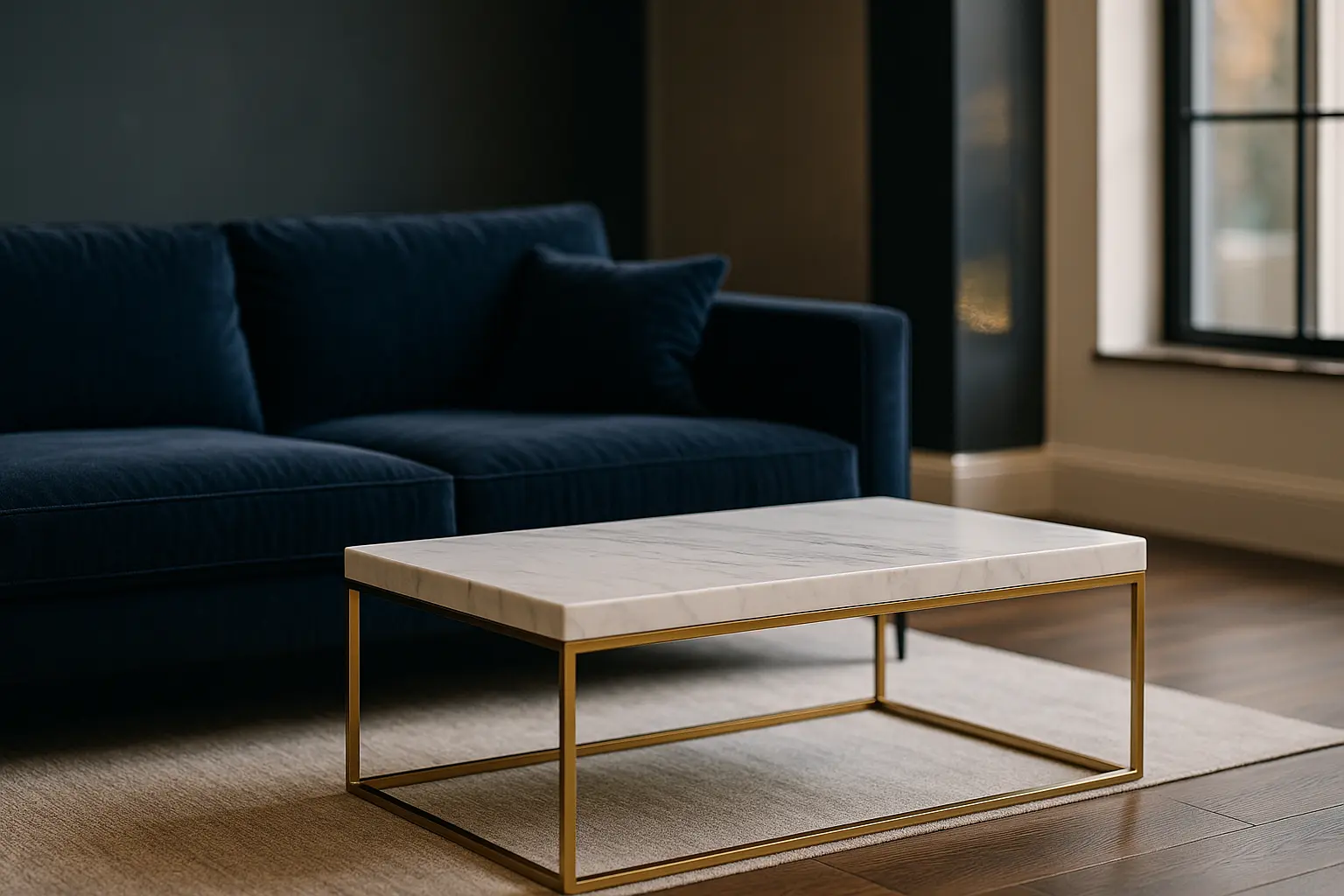
Scale and form. An oversized pendant above a low table, or a single tall vertical in a room of horizontals, produces contrast without introducing another colour or material. It is the axis most often forgotten and the one that rescues schemes that feel correct but inert.
Proportion is what makes it legible
The old decorating convention of roughly sixty per cent dominant surface, thirty per cent secondary and ten per cent accent is not the result of a study, and it should not be presented as one. It survives because it encodes something true: a contrast needs a majority to push against. Take that split to fifty-fifty and neither side leads, so the eye keeps searching for the subject of the room and never settles.
In practice the dominant field is usually walls and large floor area, the secondary is the main furniture group, and the accent is the piece you notice on entering. A single vibrant armchair against a quiet backdrop earns its place precisely because there is so little else competing with it.
Where contrast goes wrong
Three failure modes cover most of what does not work.
- Even distribution. When a strong contrast repeats at regular intervals around the room, the brain stops reading it as tension and starts reading it as pattern. Cluster the contrast instead of spreading it.
- No soft ground. Hard, cold and reflective surfaces with nothing absorbent between them create acoustic as well as visual harshness. Rugs, curtains and upholstery are part of the structure of the scheme, not a finishing touch. Getting the balance between urban edge and genuine comfort right is what separates a striking room from a livable one.
- Contrast added late. A scheme decided in neutrals and then rescued with accent cushions rarely convinces. The opposition has to be planned into the large surfaces, where it has enough area to register.
Small rooms and minimalist schemes
Contrast is not the enemy of a small space. It is the enemy of a cluttered one, and those are different problems. In a compact room, a single decisive opposition tends to work better than several mild ones, because mild contrast repeated across a small area reads as busyness.
Minimalist schemes rely on texture and value almost exclusively, since they deliberately withhold colour. A matt concrete surface beside a lacquered wall carries a full contrast on two axes at once, without a single strong hue in the room. That is why raw-material palettes so often feel richer than they look on a mood board.
Quick reference: pairings that hold
| Leading contrast | Supporting move | What to keep quiet |
|---|---|---|
| Dark joinery, pale walls | Small warm metal accents | Additional strong colours |
| Rough plaster, polished stone | Narrow tonal range across both | Competing patterns |
| Warm terracotta, cool grey-green | Consistent mid-value across the room | High-gloss finishes |
| Oversized single object | Low, horizontal furniture around it | A second statement piece |
Straight answers to the questions we get
How do contrasting colours change how a room feels?
They create a focal point and a sense of depth by giving the eye somewhere to land first. Pairing a restrained backdrop with one saturated element does this more reliably than distributing several bold colours evenly.
Which material combinations are the safest starting point?
Wood with metal, and stone with textile. Both pair a warm, absorbent surface with a cool, hard one, so they carry contrast on two axes at once and remain forgiving if the proportions are slightly off.
How much texture is too much?
Texture tolerates more repetition than colour does, but three distinct tactile families in one room is usually the practical ceiling. Beyond that the surfaces start reading as inconsistent rather than layered.
Can a small room take strong contrast?
Yes, provided it takes one. A single decisive opposition, with the remaining surfaces held close in tone, makes a compact space feel considered rather than crowded.
How is contrast introduced into a minimalist scheme?
Through finish and value rather than colour: matt against gloss, a deep tone against a pale one, a rough material against a smooth one. Lighting then does the rest by casting the shadows that make texture visible.
Deciding on the materials themselves?
Our guide to wood, steel and concrete covers how each surface behaves once it is on the wall.