
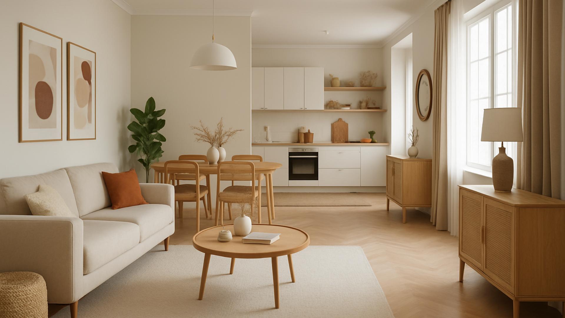
Most open-plan rooms that feel unresolved are not badly planned. They are already built, already furnished, and nothing is going to move. The question is not where the sofa should go. It is what you can do with paint, pattern and surface to make one long volume behave like three places.
If you only do four things
- Paint one zone measurably darker than the rest, and stop the colour at an architectural edge rather than at an invented line.
- Allow one patterned zone per room. A second one competes instead of separating.
- Give the kitchen zone texture, since it cannot use pattern and is hard and reflective by necessity.
- Keep the art line at a constant height across every zone. It is what stops the room fragmenting.
Colour separates faster than furniture, and you can do it in a weekend
Paint is the strongest zoning tool available to anyone who cannot rebuild. It works because the eye reads a difference in lightness before it reads anything else, and the difference has to be large enough to register as deliberate. Paint manufacturers publish a light reflectance value, or LRV, for every colour on a scale from 0 for black to 100 for pure white. Anything below about 40 behaves as a dark colour in a room. A zone that sits twenty or more LRV points below the rest of the space separates clearly. Five points apart looks like a mistake with the tin.
Where the colour stops matters more than which colour it is. In a room with walls, a colour ends at a corner and nobody questions it. In an open space there are no corners to hide behind, so the change has to land on something the eye already accepts as an edge: an inside return, a structural beam or column, the reveal of a wide opening, a change of ceiling plane, or the line of a door architrave carried across. Where no such edge exists, make one. A slim timber batten, a picture rail or a run of moulding at the junction turns an arbitrary stop into an intentional one.
Colour drenching, where the walls, ceiling, woodwork and radiators of one zone all take the same shade, is the most reliable version of this in a tall or awkwardly shaped space. It removes every internal edge within the zone, so the area reads as a single volume set into the larger room rather than as a painted patch on a wall.
Pattern marks a zone quickly and tires quickly
One zone per room takes pattern. That is the whole guidance, and it is more often broken than any other. Pattern is the fastest way to say that an area is different, which is why a papered dining alcove or a bold rug in the seating area works so immediately, and why a second pattern elsewhere cancels the first rather than reinforcing it.
Scale decides whether it reads from across the room. In a long open volume, small repeating motifs disappear into texture at five metres and simply make the wall look busy. A large-scale pattern with generous space between elements holds its identity at distance, which is the only distance that matters in a room you mostly see from the other end of.
Texture is the kitchen’s only available signal
The kitchen zone cannot use pattern. It already contains a great deal of visual information in the form of appliances, handles, sockets and reflective surfaces, and adding pattern to that produces noise. It usually cannot take a dark colour either, at least not on the working surfaces, because task areas need light.
What it can take is texture, applied at the boundary rather than throughout. Timber stools against a lacquered island, a woven runner on a tiled floor, a linen blind above a stainless splashback, an open shelf in oak in a run of otherwise handleless doors. Each of those reads as a deliberate softening at the point where the kitchen meets the rest of the room, which is precisely where the boundary needs to be legible.
The same logic works in reverse for the seating zone. If the sofa area is entirely soft, one hard element, a stone side table or a metal frame, keeps it from drifting into a different house from the kitchen fifteen feet away.
| Signal | How far to push it |
|---|---|
| Colour | At least 20 LRV points of difference, stopped at a real or added edge |
| Pattern | One zone only, large scale, readable from the far end of the room |
| Texture | Every zone, concentrated at the boundaries between them |
| Height | Constant across zones. This is the one to hold, not to vary |
Eye level is the layer nobody decorates
Hang everything on one line. Galleries and museums centre artwork at around 145 cm, roughly 57 inches, from the floor, because that is close to average adult sightline. In a conventional house the rule is a convenience. In an open plan it is structural, because you see three zones at once and any inconsistency in hanging height registers as untidiness long before anyone works out why.
So vary what hangs, not where it hangs. A single large canvas over the sofa, a tight grid of small frames in the dining zone, an open shelf of objects near the kitchen, all centred on the same horizontal line. The line itself becomes an invisible thread tying the zones together, which buys you permission to be much bolder with colour and pattern below it.
Repeat something in every zone
Zones need one shared element to stay part of the same room. Pick two and repeat them everywhere: a metal finish that appears in the kitchen handles, the light fittings and the picture frames, plus an accent colour that shows up once in each area, in a cushion here, a chair frame there, a single object on a shelf. It costs almost nothing and it is what separates a considered open plan from a room decorated in instalments.
Below roughly 30 square metres, be less ambitious. In a studio or a small flat, two zones handled well beat four handled thinly, and much of the work shifts to lighting, since a lamp switched on in one corner while the rest stays dim divides a small space more convincingly than any amount of paint.
When decoration is not what is wrong
If the room still feels awkward after all of this, the problem is upstream. Rooms fail when people have to walk through a seating group to reach the kitchen, or when a zone sits across a daily route rather than beside it, and no colour scheme survives that. Our guide to defining functional zones in an open space deals with circulation, furniture orientation and the constraints that come before any decorative decision.
Two questions we get asked
Can paint alone define a zone in a rented flat? Where redecoration is allowed, yes, and it is the highest-impact change available. Where it is not, the substitutes are a large rug, a full-height curtain hung on a ceiling track, and a tall plant or two at the boundary, all of which come away without trace at the end of a tenancy.
Should each zone have its own style? No. Each zone should have its own emphasis within one style. A dining area can be darker and more formal than the seating area while sharing its palette, materials and hanging line. Genuinely different styles in one visible volume read as indecision rather than as zoning.
Working on one very large wall in that open space?
Long uninterrupted walls need a different approach from the ones you can fill with a single picture.
Sources: light reflectance value scale as published by paint manufacturers; the 145 cm centre-line convention used in gallery and museum hanging practice.