
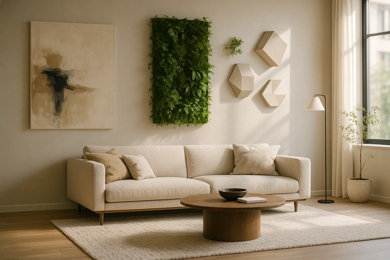
A large wall is rarely ruined by emptiness. It is ruined by five separate good ideas applied at once, each of them fighting the others for the same field of view.
The five approaches, in short
- One oversized piece, sized to the furniture and hung low.
- A grid of identical frames, which behaves like a single object rather than a collection.
- A material panel: plaster, timber, blackened steel, acoustic felt.
- Shelving used as line rather than storage, kept deliberately underfilled.
- Light as the subject, with the wall surface itself as the finish.
Get the eye line right before choosing anything
Almost every crowded wall started with a hanging height problem. Galleries and museums generally centre work at around 57 inches, roughly 145 cm from the floor, because that approximates standing eye level, and the convention is worth borrowing at home for one reason: it stops each new piece finding its own arbitrary height and turning the wall into scattered noise.
Two adjustments apply in a living room. Above a sofa or a console, drop the composition so the lower edge sits about 15 to 20 cm above the furniture, which visually ties the two together instead of leaving a stranded gap. And size the arrangement to roughly two thirds of the width of the furniture beneath it. A piece that is too small over a three-metre sofa is the single most common reason people conclude they need more pieces, when what they needed was one larger one.
One oversized piece
The most effective answer to a big blank wall is usually one big thing. A single large canvas, a photographic print, an antique mirror or a textile hanging occupies the wall with one decision, and it fails only when it is undersized.
On a wall over three metres wide, that means thinking in metres rather than in standard frame sizes. Where budget rules out original work at that scale, mounted photographic prints, vintage maps, botanical plates and salvaged signage all reach large formats cheaply, and in an industrial interior a raw plywood or blackened steel frame reads better than a fine gilt one. Weight is the practical limit. Anything substantial needs to be fixed into structure or into the correct hollow-wall anchors rather than a picture hook, and on plasterboard that means locating the studs first.
A grid rather than a gallery wall
The gallery wall gets recommended constantly, and it is the hardest of the five to control, because every added frame is another decision that can go wrong. A grid removes that problem by imposing one rule and repeating it.
Take between six and twelve identical frames, hang them in a strict rectangle with a consistent gap of five to eight centimetres, and let the content vary while the container does not. The eye reads the block as one object, which is exactly what an overcrowded wall fails to do. Work from the centre outward with the whole layout drawn on the floor or marked with paper templates first, because a grid is unforgiving of a frame that sits a centimetre off line.
Treat the wall as a material
The most direct way to stop a wall competing with its contents is to make the surface itself the point and hang nothing at all. This is where an industrial interior has an advantage, because the vocabulary already exists: lime or clay plaster with visible trowel movement, wide vertical timber boards, blackened or oiled steel sheet, exposed brick left unsealed.
Acoustic felt panels belong in the same category and solve a second problem at the same time. Large hard walls in open-plan rooms generate the echo people describe vaguely as the room feeling cold, and a felt or fabric panel across part of the wall measurably softens it while reading as a deliberate material choice. The same logic runs through our notes on decorating with raw, unfinished textures, where the surface does the work that objects would otherwise be asked to do.
Shelving as line, not as storage
Long floating shelves draw a horizontal line across a wall and hold very little. That restraint is the whole point, and it is where most people lose control of the idea.
One or two shelves running two metres or more, mounted on concealed brackets or steel cleats, give the wall structure. Fill them to somewhere around half their length, group objects in odd numbers, and vary height while keeping a common material or tone. A shelf that ends up carrying books to both ends has become storage, which is a legitimate thing for a wall to do but a different project from this one. Check the bracket rating before loading anything, since long spans deflect visibly under weight and a sagging shelf undoes the line it was installed to create.
Let light be the subject
Lighting is the least used of the five and often the most effective on a large wall, particularly a textured one. A linear wall washer or a row of directional spots placed 20 to 30 cm off the surface throws a raking light down it that reveals plaster movement, brick edges or timber grain and changes completely between day and night.
Picture lights, plug-in sconces and track systems all achieve a version of this. Anything hard-wired is electrical work: in most jurisdictions new circuits or fixed outlets must be installed by a qualified electrician to the applicable national wiring standard, and tenants generally need the landlord’s written agreement before any fixed installation. Plug-in fittings with a discreet surface conduit avoid the question entirely and are simple to reverse.
Quick answers
Which approach suits a wall in a rented flat?
An oversized leaning piece, a felt panel on removable fixings, or plug-in lighting. All three are reversible and avoid both structural fixings and electrical work.
Can a living green wall work on a large interior wall?
It can, but treat it as a building project rather than a decorating one. Irrigated systems need a waterproof backing, a drainage route, a maintenance schedule and honest thought about the light the wall actually receives. A failed green wall on a large surface is far more conspicuous than a bare one.
What if the wall has to hold a television?
Let the screen be the single dominant object and organise everything else around it. A material treatment across the whole wall, in a dark tone, absorbs a television better than any arrangement of frames placed beside it.
| Approach | Best on | Main risk |
|---|---|---|
| Single oversized piece | Wide walls behind seating | Choosing it too small |
| Frame grid | Long corridors and stairwells | Alignment errors, which show immediately |
| Material panel | Echoing open-plan rooms | Cost, and difficulty of reversing it |
| Long shelving | Walls that need to work as well as look | Gradual overfilling |
| Lighting | Textured or masonry surfaces | Electrical work and its constraints |
Still hesitating between restraint and impact?
Our guide to styling large walls goes further into keeping a big surface interesting without letting it fill up.