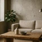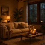

A room can hold six different colours and still look flat. That is the usual complaint behind the phrase needs more contrast, and it is almost always the same problem: plenty of hue variety, almost no difference in lightness. There is a way to check it in about thirty seconds, and a short list of fixes you can undo.
The short version
- Value beats hue. The eye separates light from dark long before it separates colours.
- The greyscale photograph tells you in seconds whether a scheme has any value range at all.
- Light Reflectance Value puts a published number on it, and a 30-point gap is a useful floor.
- Work up the ladder: textiles, then a dark object, then the lighting, then hardware, then paint.
The greyscale test, and why it works
Take a photograph of the room from where you usually sit, then convert it to black and white on your phone. What you are looking at is the room stripped of hue and reduced to value alone. A scheme with real contrast will show clear lights, mid-tones and darks. A scheme without it turns into an even field of grey, and that grey is precisely what the room feels like when you walk in.
This works because human vision reads lightness earlier and more sharply than it reads colour. Two objects can be strongly different in hue, a sage green cushion on a dusty pink sofa, and be almost identical in value, in which case the eye never registers a boundary between them. That is the mechanism behind the flat room that contains, on paper, plenty of colour.
Light Reflectance Value turns the test into a number
Light Reflectance Value, or LRV, is the proportion of visible light a surface reflects, expressed from 0 for a perfect black to 100 for a perfect white. Paint manufacturers, tile suppliers and laminate producers publish it for most of their ranges, and it is free to look up before buying anything.
Accessible design has already set a threshold worth borrowing. Guidance in this field, including the British Standard BS 8300-2:2018 on the design of accessible buildings, treats a difference of around 30 LRV points between adjacent surfaces as the benchmark for visual contrast that people can reliably perceive. It exists for navigation and safety rather than for decoration, but the underlying fact is the same one: below a certain gap, the eye does not read a difference at all. Used as a floor rather than a target, it turns a vague instinct into a check you can perform on a supplier’s data sheet.
Five moves, ordered by how easily you can undo them
1. Textiles, for an afternoon’s work
The cheapest genuine value change in any room is a dark throw, a dark rug or a set of curtains several steps deeper than the walls. Textiles carry weight visually because they cover area, and area is what makes contrast legible. A single dark cushion does nothing; a two by three metre rug in a deep tone changes the whole photograph.
2. One dark object at eye level
Rooms read from the horizontal band around eye level, so that is where a dark anchor earns the most. A blackened metal lamp, a dark ceramic vessel, a heavy framed print with a dark mount. The object does not need to be large, it needs to be unambiguously darker than everything around it and positioned where the eye already goes.
3. Change the light rather than the surfaces
Contrast is partly manufactured by lighting. A room lit evenly from a central ceiling fitting has almost no shadow, and shadow is contrast. Two or three low-level lamps produce pools of light and areas of relative darkness, which reads as depth. Cooler light also increases apparent separation between surfaces, while very warm light pulls everything towards a single tone. Nothing here is permanent, and the effect at night is immediate.
4. Hardware, frames and small joinery
Swapping handles, a curtain pole, switch plates or shelf brackets for something in a dark finish threads a consistent dark line through a pale room. It is a modest intervention that survives a change of taste, because the pieces are small, cheap and unscrewed in minutes.
5. One painted plane, and only one
The most effective and least reversible move is to paint a single plane in a deep tone: a chimney breast, the inside of an alcove, the back of a bookcase, one door, or the wall behind a bed. Choosing a plane rather than an object matters, because a plane has area and a defined edge, which is what the eye needs in order to read a boundary. One plane per room is usually the ceiling of what a small space will carry.
| Move | Time | Reversible | Visible effect |
|---|---|---|---|
| Dark rug or curtains | An afternoon | Completely | High, because it covers area |
| Dark object at eye level | Minutes | Completely | Moderate, and precise |
| Lamps instead of the ceiling | An evening | Completely | High after dark, none by day |
| Hardware and frames | An hour or two | Mostly | Low individually, cumulative |
| One painted plane | A weekend | At the cost of repainting | The highest of the five |
Three ways easy contrast still goes wrong
The first is even distribution. Dark elements spread uniformly around a room cancel each other out, because contrast needs somewhere to concentrate. Group the dark tones so that one part of the room clearly leads and the rest stays quiet.
The second is contrast applied only to objects. A room whose planes, walls, floor and ceiling, are all within a few points of each other will not be rescued by accessories, however dark they are. At some point one surface has to change, and that is why the painted plane sits at the end of the ladder rather than being skipped.
The third is scale. A feature too small to be legible from where the room is used adds clutter rather than contrast, and the same applies to raw or textured materials introduced in insufficient quantity. We have catalogued the recurring cases in our list of mistakes to avoid when decorating with raw materials, and undersizing appears in almost all of them.
Quick answers
Does adding contrast make a small room feel smaller?
Not by itself. What shrinks a small room is busyness rather than darkness, and a single deep plane with everything else held close in tone usually makes a compact space read as deliberate rather than cramped.
Can I get contrast without any dark colours?
Yes, through finish. A matt surface beside a polished or lacquered one carries a real contrast even when both are the same shade, because they behave differently under light. That is the route to take when the palette has to stay pale.
How do I know if I have gone too far?
Repeat the greyscale test. If the photograph now shows several competing dark masses and no clear hierarchy, one of them needs to go. Contrast works when something leads.
Does this apply to a rented flat?
The first four moves are all available without touching a wall, and the fourth can usually be reversed by keeping the original hardware in a drawer. Only the fifth needs permission.
Want the mechanics rather than the shortcuts?
Colour, material and texture each carry contrast differently, and knowing which one is leading is what keeps a scheme coherent.
Published on 16 May 2025. Updated on 15 August 2026. Sources: Light Reflectance Value scale and the 30-point difference benchmark used for visual contrast in accessible design, including BS 8300-2:2018; manufacturer-published LRV data for paints and surface finishes.