Two floors can share a species name, a price bracket and a photograph on the same supplier page, and still look nothing alike once they are laid. What separates them is a short list of visual variables that almost never appear on the front of a sample board.
The four variables to settle before ordering
- Undertone, judged against the fixed elements of the room rather than against the wall paint.
- Format, meaning plank width, plank length and the direction they run.
- Sheen, which is a measured property and the one people regret most often.
- Joint, meaning bevel, grout width, and how often a printed pattern repeats.
Undertone is what makes a floor argue with a room
Every floor finish carries an undertone, warm or cool, and that undertone is what clashes or agrees with everything else. Two oak floors described as natural can sit at opposite ends of that scale: one pulling gold and pink, the other pushed grey by a white-pigmented oil. Photographed separately they look interchangeable. Laid next to the same brass tap they do not.
The practical rule we keep coming back to is to judge a floor against the fixed elements of the room, not against the walls. Paint costs a weekend to change. Kitchen fronts, worktops, stone, staircases and internal joinery do not, and those are the surfaces a floor has to live with for a decade. Hold the sample flat on the ground beside them, which is where it will be seen, rather than upright at chest height in a showroom.
Format changes the perceived size of a room more than colour does
Plank width and length control the number of joint lines the eye has to cross, and that count is what makes a room read calm or busy. Narrow strip flooring in a small room multiplies lines across a short span. Wide, long boards reduce them, which is why a modest room often looks larger in a wide plank despite the received wisdom about small rooms needing small formats.
Direction matters as much as dimension. Running boards along the longest wall stretches the space; running them towards the main window follows the light and hides the shadow that grazing daylight throws across every joint. Patterned lays such as herringbone or chevron do the opposite on purpose, breaking the run into a texture and shortening the room visually. In tile, the same logic applies to module size and to how the grid meets the walls, so plan where the cut tiles fall before the first one is fixed.
Sheen is the variable people forget, then regret
Sheen is the amount of light a finish bounces back, and it is a measured property rather than a matter of description. A supplier can give you the gloss level of a finish, and it is worth asking, because the words matt, natural and satin are used loosely across the trade.
The consequences are practical. A high-gloss surface mirrors the window and lifts a dark room, and it also shows every scratch, every footprint and every speck of dust at a raking angle. A matt finish absorbs that reflection, hides fine scratching well, and in some formulations shows smears more readily. In a bright, south-facing room, a glossy floor can produce genuine glare in the afternoon. That is a comfort problem, not a taste problem, and it does not improve with time.
The joint is where a product tells the truth about itself
A bevelled edge draws a shadow line around every plank, so the floor reads as a collection of boards. A square edge lets it read as a single continuous surface. Neither is better, but the choice sets the character more firmly than the colour does, and a micro-bevel also collects dust that has to be vacuumed rather than wiped.
On printed products, laminate and luxury vinyl, there is a second question worth asking: how many unique plank decors are printed in the range. The decor is a film, and a range with few unique designs will visibly repeat the same knot and the same grain sweep several times in one room. Suppliers can usually answer, and a low number is the single most reliable predictor of a floor that looks synthetic once it covers forty square metres. In tile, the equivalent question is grout width and grout colour: matching the grout to the tile dissolves the grid, contrasting it turns the grid into the pattern.
| Variable | What it controls | Ask the supplier | How it disappoints |
|---|---|---|---|
| Undertone | Agreement with joinery and stone | A sample large enough to lay flat | Reads pink or green beside fixed finishes |
| Format | Perceived size and calm of the room | Board dimensions and recommended lay | Busy joint lines in a small space |
| Sheen | Glare, and how visible wear will be | The measured gloss level of the finish | Afternoon glare, or every scuff on show |
| Joint | Whether it reads as boards or a surface | Bevel type, number of unique decors | Visible pattern repeat, dust in bevels |
One floor, or one floor per room
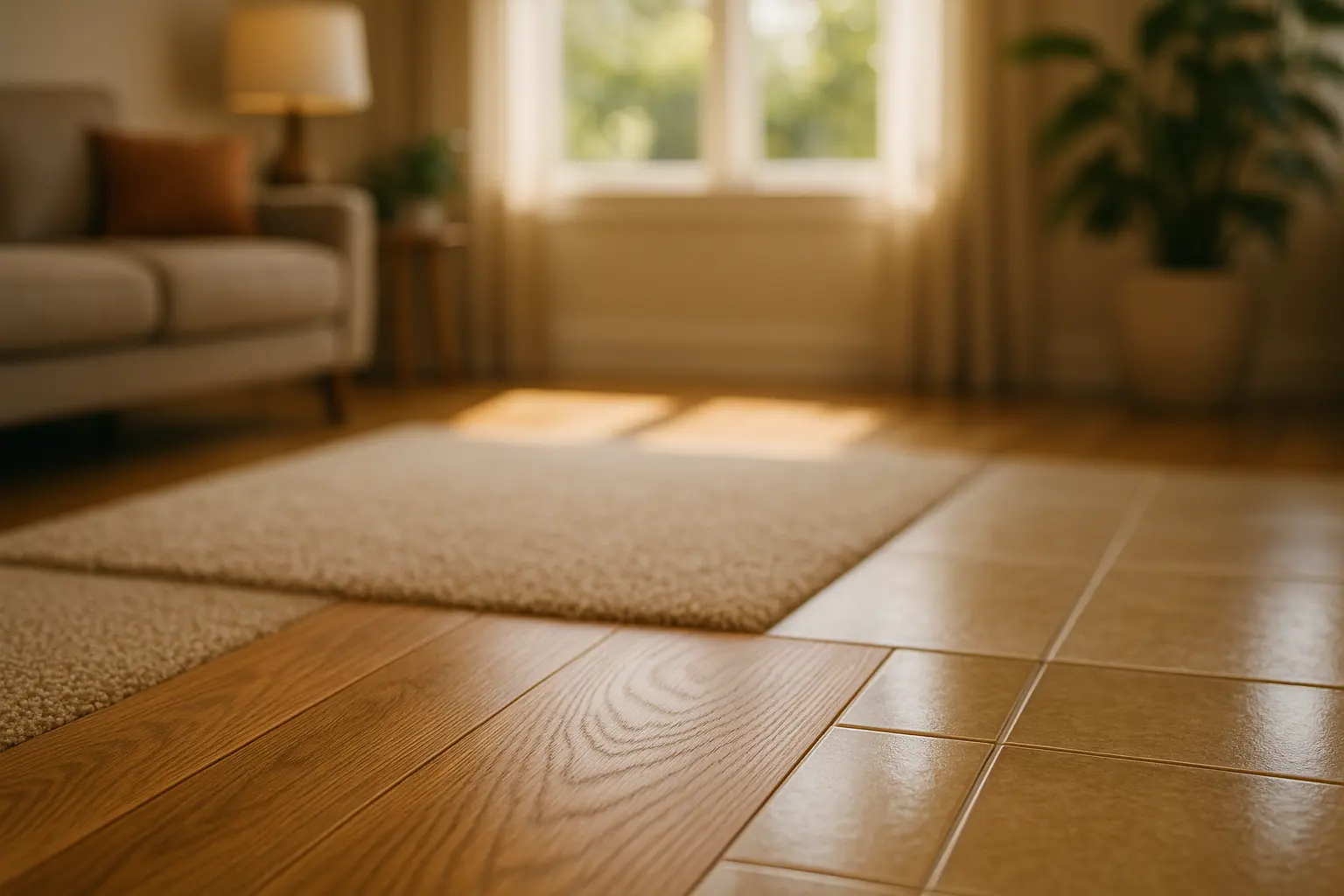
Style also depends on where a floor stops. Carrying a single material through hall, living room and kitchen makes a modest flat read as one volume, and it removes the thresholds that chop a plan into cells. Changing material at every door does the opposite, giving each room a separate identity at the cost of visual size.
Open-plan layouts sit awkwardly between the two, because the floor is often the only continuous surface left and the temptation is to use it to mark territory. In practice a continuous floor with the zoning carried by rugs, lighting and furniture lines tends to age better than a patchwork of materials, and it leaves the arrangement free to change. We have set out that approach in more detail in our guide to defining functional zones in an open space.
Test it in the room, and give it time to settle
The showroom is the worst place to make this decision, and the room is the best. Take the largest sample the supplier will release, lay several pieces together on the ground rather than holding one up, and look at them at three moments: morning light, mid-afternoon, and under the artificial lighting you actually own. Undertones flip between those three more often than people expect.
Two technical points follow the aesthetic ones. Timber and engineered boards need acclimatising in the room before installation, with a moisture content in the region of six to nine percent for a heated interior, or the joints will open through the first winter. And hardness is comparable rather than descriptive: the Janka scale gives a number for a species, which is a far more useful answer than the phrase solid wood. Once the look is settled, the durability shortlist is a separate exercise, and one we have set out room by room.
Questions that come up once the samples are home
Should the floor be lighter or darker than the walls?
Either works, provided the difference is decisive. A floor and a wall a few shades apart reads as a mistake rather than a scheme, while a clear separation reads as intent. Darker floors ground a room and make ceilings feel lower; lighter floors bounce daylight and are more forgiving of dust in a busy household.
Does the floor have to match the internal doors and skirtings?
No, and matching them exactly is usually harder than contrasting them. Painted joinery in an off-white or a deep tone sits comfortably against almost any floor, which is why it remains the reliable answer when the floor is already chosen.
Can the same floor run through a bathroom or a utility room?
Only if the product is rated for it. Continuity is a strong visual argument, but water resistance is a specification, not a preference, and most timber ranges are not intended for a room that gets wet daily. Look for a matching format in a suitable material rather than pushing the original one where it does not belong.
Is a sample from the internet reliable?
For format and sheen, broadly yes. For undertone, no. Screens and print both shift colour, and the finish on a photographed board is lit for the photograph. Anything that matters visually needs a physical sample in the room it is destined for.
Now for the part style does not decide
Once the look is agreed, wear ratings, moisture exposure and underfloor heating narrow the list quickly, and often to something you had not considered.
Published on 16 May 2025. Updated on 15 August 2026. Sources: Janka hardness scale as used in timber trade specifications; recommended interior moisture content ranges for timber joinery in heated buildings; manufacturer specification sheets for gloss level and decor variation on laminate and luxury vinyl ranges.